Introduction
This lesson will look at user interface design and how UI kits help designers create more consistent and appealing interfaces.
What is UI design?
User interface design refers to the visual elements of a product. Simply put, it is the look and feel of a website. The branding for a company should come through in the user interface design to attract and engage the target audience.
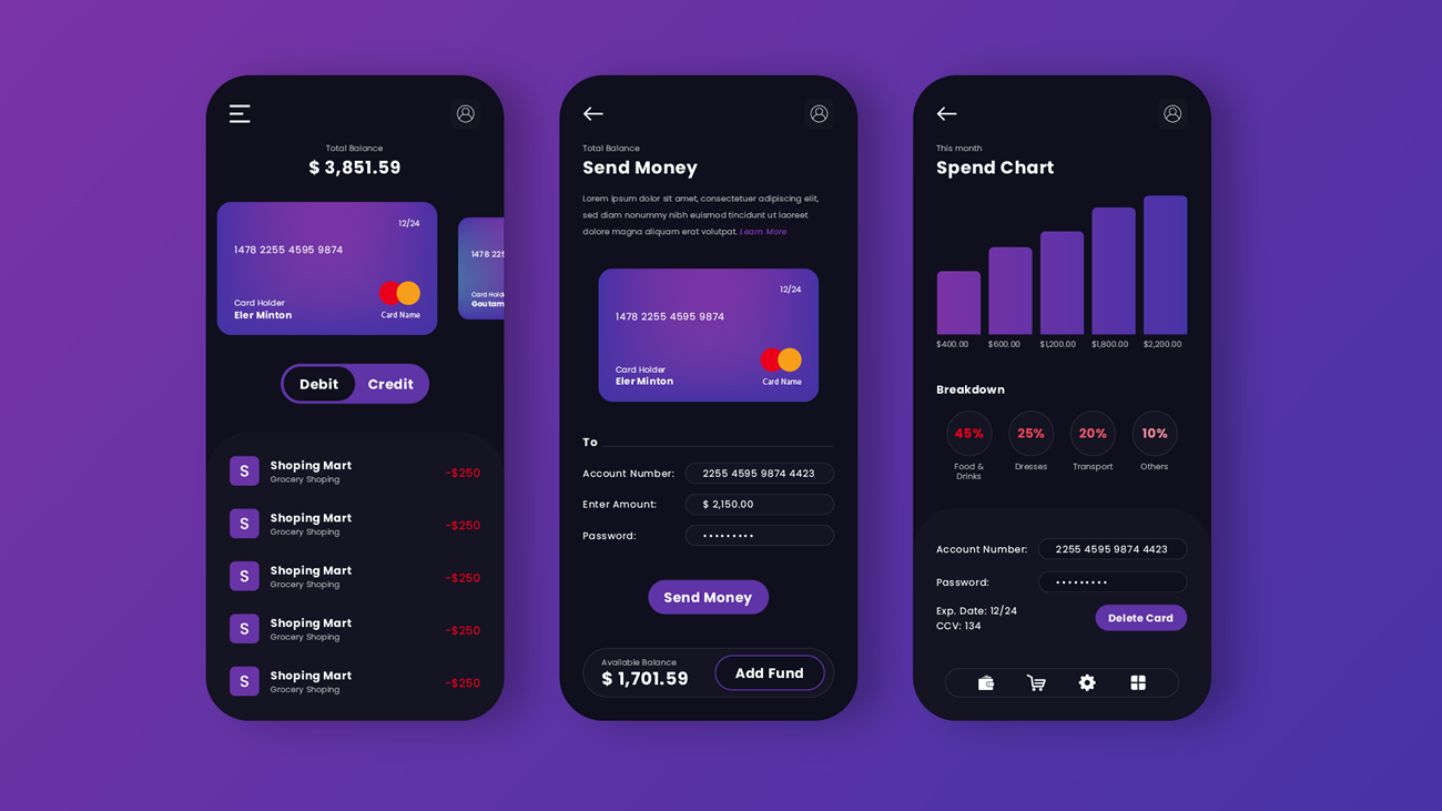 Figure 1. The interface of a banking app.
UI design is focused specifically on the point of contact where a human user interacts with a website or app. How the website looks and guides a user towards the page’s goal is what UI design is all about.
Example of UI design
A food ordering app’s user interface is there to make the user feel good about ordering food and guides them towards satisfying their hunger.
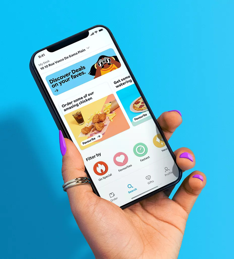 Figure 2. Mr. Delivery Mobile food app, 2022.
The most crucial UI design aspect is to make the interaction between human (user) and software (product) easy and smooth while also keeping the look attractive and straightforward.
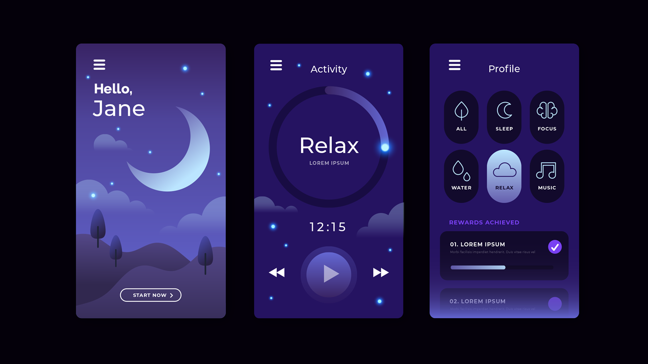 Figure 3. An example of an app that helps users relax and fall asleep easily.
UI elements
UI elements refer to the app or website’s design elements that the user will be interacting with to reach the end goal. Examples of user interface elements include the following:
Input controls
Input controls let the user input information on the website or app. An excellent example of input controls is list boxes, where users can select multiple items at once. Another good example is text fields where the user enters text like an email address, name, surname and phone number.
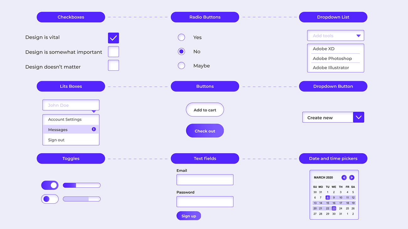 Figure 4. Input controls.
Navigational components
Navigational components focus on steering the user in a specific direction. Any element that helps the user navigate the page may be seen as a navigational component.
Good examples are icons and pagination. When the user clicks on the cart’s icon, they will be directed to the cart page, and when a user searches for an item, they will be directed to the search results page.
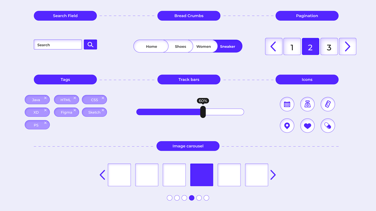 Figure 5: Navigational components.
Informational components
Any form of communication with the user can be seen as an information component. This includes items such as the notification that an item was successfully added to your shopping cart. Information components inform the user of progress, give them tips on how to use specific tools and allow them to become involved with a brand by signing up for newsletters, for example.
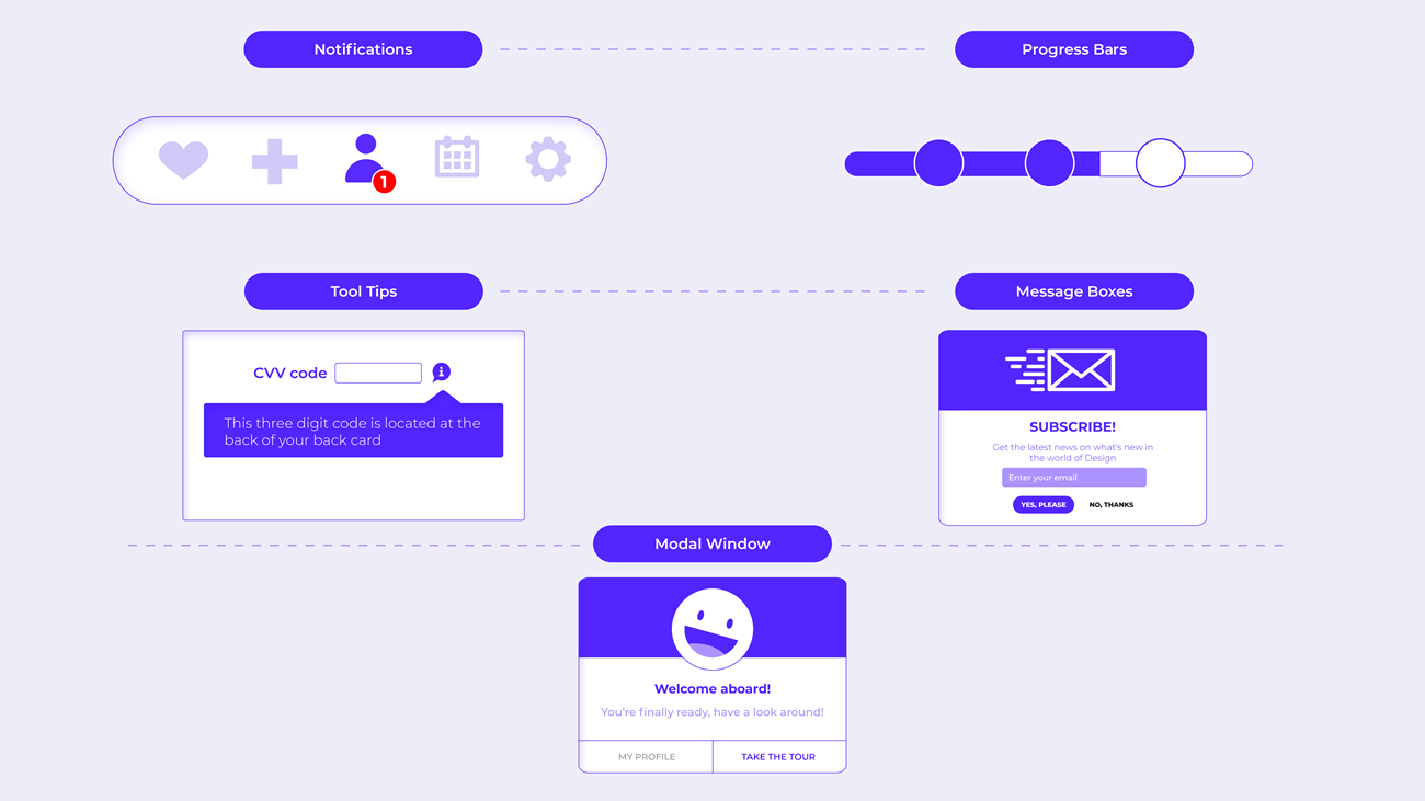 Figure 6: Informational components.
Containers
Containers are elements that contain other elements. One such design element is the accordion. An accordion consists of a list of items that are vertically stacked. Each of these elements hides a series of other design elements that are revealed when the user clicks on the accordion panel. More information is revealed when the specific accordion panel is activated by pushing existing page content further down the page.
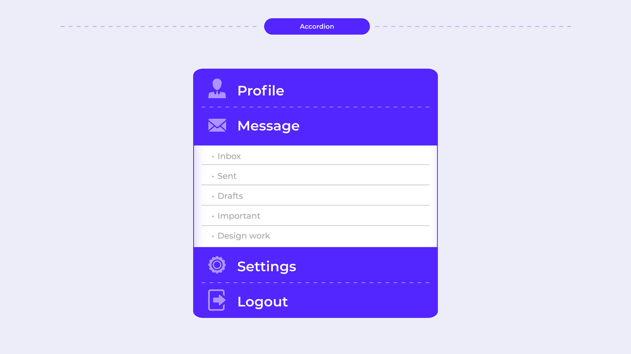 Figure 7: An example of an accordion.
Interface inventory
Brad Frost coined the term ‘interface inventory’ and explained that it is similar to content inventory. However, instead of taking stock of a website’s content such as text, images and documents, you will concentrate on the interface’s design components, the bits and pieces that make up the website (Brad Frost, 2013). Interface inventories are useful since they help keep UI elements consistent and cohesive across the board.
You may be asking where and when this process starts. It can be for an existing website that needs to be updated or for a new website. In the case of a new website, you will be guided by what competitors are doing and what needs to be considered for the brand. Either way, it is vital to keep design choices and components consistent from start to finish.
How to create an adequate interface inventory
Screenshots
The process starts by taking screenshots of the design components. Every element needs to be added, from the smallest icon to more prominent components such as headers and images. Every component plays a role in the overall design and, therefore, should be included. The following are some interface components which should be considered:
- typography
- colours
- graphics and images
- media
- forms
- buttons
- tables
- navigation
- lists
- interactive components.
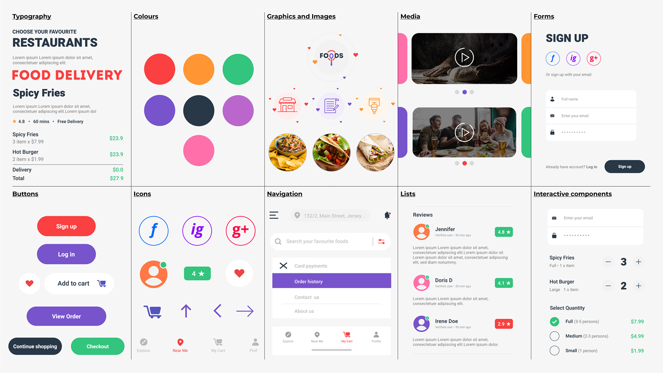 Figure. 8: An example of an interface inventory.
Categorising and grouping components
The second step in the process is to take all the gathered screenshots and place them in different categories. For example, take all the screenshots you have gathered of the different buttons used on the website and place them all together in one document. You will quickly see if the style of the button is consistent across the website.
You should do this with all the interface components you have gathered. As you can see from figure 8, most of the components are consistent. Components that can use some tweaking are social media icons. Their colour is somewhat different to the colour palette and other icons on the site.
Share, discuss and review
After gathering all the information and placing them in one document, assemble team members and perform a review. The review should give you a clear indication if elements are consistent or if they need to be investigated and refined more thoroughly.
Pattern libraries and UI patterns
The inventory interface process helps us spot inconsistencies in the design, but it will also help recognise any recurring design patterns. A design pattern is employed when designers reuse elements to solve a problem in the user interface.
An excellent example of a UI pattern is breadcrumbs that assist the user with navigation by retracing the user’s steps. Another example is the home link where the brand’s logo is clickable and directs the user back to the homepage or the site’s starting point.
With both these examples, the design pattern will be reused on almost every website page. Some examples of UI patterns include the following:
password strength meter – to indicate whether the user’s password is sufficient
calendar picker – where a user can click on a specific date which will be highlighted and added
module tabs – when content needs to be separated, users can then switch between the content sections by clicking on the tabs
notifications – users are informed of important messages or updates by receiving a notification
breadcrumbs – indicate where the user is on the site and how they can get back to where they started if needed
home link – helps the user return to the start location - a brand’s logo is usually the home link
carousel – allows the user to browse through a set of items and gives them the ability to select one
pagination – gives users the ability to browse through a sorted list of products.
The UI pattern library is made up of many such design patterns. There are contrasting opinions as to whether these design patterns serve as a design system. Some believe it is the same as a brand’s style guide.
To learn more about the broad range of design patterns and see examples of their usage, browse the website UI patterns here: http://ui-patterns.com/patterns
Design systems
As mentioned, some may say a pattern library is the company’s design system, but let’s break it down and see what a design system consists of.
Let’s look at the design system as a container; there are three compartments inside: the visual design language, the pattern library and the style guide:
The visual design language - refers to the brand’s colour palette, typography, imagery and grid system, logo, and slogan, to name a few.
Pattern library - refers to the collection of the recurring/reusable design patterns.
Style guide - the rules and guidelines on how a brand’s assets should be used. What is allowed with regards to typography, colour and the logo, for example? The style guide doesn’t only focus on the visual aspect of things but also on how to write the content.
Design systems are assembled in code and provide designers and developers with a complete guide, including design standards, documentation on which components must be used and how to use them.
UI kits
A UI kit is a useful resource that can assist UI designers in designing an interface. UI kits are handy tools to get inspiration from and help save time in the design process. A UI kit consists of components such as fonts, icons, buttons, checkboxes, to name a few. Below is an example of Material Design UI kits that are open for designers to use. Here are more UI Kits on Figma Community
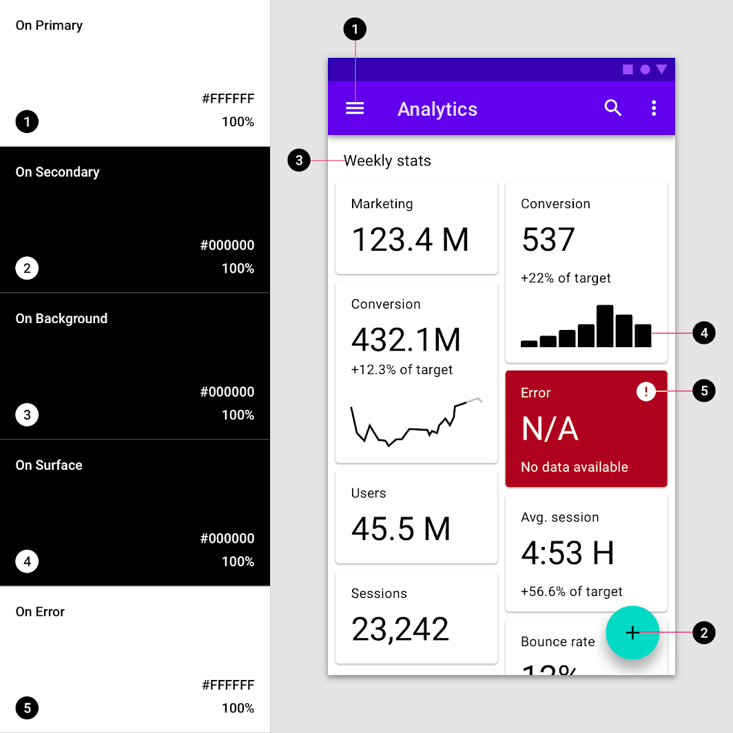 Figure 9: Material Design UI example (Source: material.io).
Lesson Task
Brief
Gather UI patterns and components for a food delivery app called Mobile Meals. You can decide if you want to design these yourself or if you want to use a UI kit.
The target audience for this app is aged between 25 and 35. They have busy schedules, so cooking time is limited and ordering food online is more convenient to accommodate their busy lifestyles. Popular restaurants include The PizzaGuy, The BurgerBar and PlatedFresh, a restaurant specialising in healthy food.
Level 1 Process
- Conduct an interface inventory of similar apps to see what competitors in the market are doing. Please pay attention to what these competitors did right and what they did wrong regarding the UI elements. Furthermore, investigate if the general use of buttons, icons, typography, etc., is consistent across the site.
- Explore Figma UI Kits for free UI kits or any other resource that you find helpful.
- Create a 1920 x 1080px artboard in Figma. You can create multiple pages for your elements in Figma or place all the elements on one page, depending on the number of elements you’ll use to design the website.
- Think about what will be best with regards to colour, typography and imagery choices. Ensure these are used consistently throughout the design.